

Quality control data representation tools are the set of tools and techniques that represent quality control data in graphical format. PMBOK 6th edition has grouped all tools and techniques in six major categories; data representation is one such category. Control quality process also uses tools from other categories such as data gathering and data analysis. Hence, this post covers all the four essential quality control data representation tools.
Table of Contents
Quality Assurance Vs Quality Control
The key difference between quality assurance and quality control is that; quality assurance finds application during the project’s planning and executing phases. Moreover, quality assurance provides confidence that the stakeholder’s requirements will be met.
On the other hand, quality control finds application during the project executing and closing phases. Quality control formally demonstrates, with reliable data, that the sponsor and/or customer’s acceptance criteria have been met.
What is Quality Control?
Quality control is the process of monitoring and recording results of executing the quality activities. It is chiefly carried out to assess performance and recommend necessary changes to project deliverable.
The quality control process helps in identifying the causes of poor process or product quality and recommend actions to eliminate them. It also helps to validate that project deliverable meet the requirements specified by key stakeholders necessary for final acceptance.
The control quality process uses a set of tools to verify that the delivered output will meet the requirements.
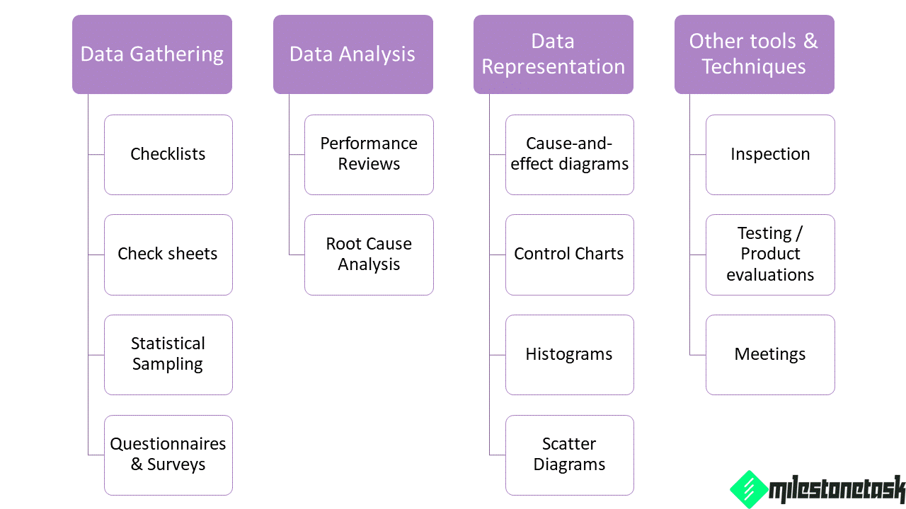
Control Quality Tools and Techniques
The control quality process uses tools and techniques from three different groups such as data gathering, data analysis and data representation. Further, this process also makes use of other tools that do not fall into the new structure of tools and techniques.
The following figure provides all tools and techniques used in the control quality process.
Quality Control Data Representation Tools
Quality control data representation tools help present data in visual format. Data visualisation links data analysis and its outcome. Visual representation also helps to communicate outcome of the data analysis process clearly and concisely. Following paragraph enumerates four quality control data representation tools.
- Cause and effect diagram
- Control Chart
- Histogram
- Scatter Diagram
Cause and Effect Diagram
The first quality control data representation tool is a cause-and-effect diagram. Fishbone / Ishikawa or why-why diagram is the alternate name for this quality tool.
The “head” of the fishbone carries the problem statement. It is the starting point to trace the problem’s source back to its actionable root cause. The problem statement typically describes a process gap or a quality objective.
The causes are found by looking at the problem statement and asking “Why” until the actionable root cause has been identified or until the reasonable possibilities have been exhausted.
The major categories of potential causes form the structural “bones” and likely causes make up the “ribs”.
Fishbone diagrams often prove useful in linking the undesirable effects seen as special variation to the assignable cause upon which project teams should implement corrective actions to eliminate the special variation detected in a control chart
The following figure is a schematic representation of cause-and-effect diagram.

Histogram
Histogram is the second quality control data representation tool. A histogram is a special form of bar chart which describes the central tendency, dispersion, and shape of a statistical distribution.
A histogram summarizes data measured on a continuous scale, showing the frequency distribution of some quality characteristic (in statistical terms central tendency and dispersion of the data).
Unlike the control chart, the histogram does not consider the influence of time on the variation that exists within a distribution.
Also read: Pareto Chart How to Create and Analyse
Control Chart
The third quality control data representation tool is a control chart. Control chart is a time oriented diagram that determines if a process is stable or not. It also indicates if a process has predictable performance.
Each control chart has a centre line, statistical control limits, and control data. Some control charts also contain specification limits. The center line is a solid line that represents the mean or the arithmetic average of the measurement of counts. There are two statistical control limits:
- the upper control limit for values greater than the mean.
- the lower control limit for values less than the mean.
Standard statistical calculations and principles determine the control limits. Control limits ultimately establish the natural capability for a stable process. Upper and lower control limits are different from specification limits. Upper and lower specification limits are based on the requirements of the agreement. They reflect the maximum and minimum values allowed for a process.
The project manager and appropriate stakeholders may use the statistically calculated control limits to identify the points to initiate corrective actions to prevent unnatural process performance.
The corrective action typically seeks to maintain the natural stability of a stable and capable process.
Control Chart Interpretation
Generally, the +/-3 standard deviation around a process mean indicates the control limits for a repetitive process. Zero standard deviation specifies the value of the process mean. The following conditions establish if a process is out of control:
- A data point exceeds a control limit.
- Seven consecutive plot points are above the mean.
- Seven consecutive plot points are below the mean.
Control charts can monitor various types of output variables, most frequently used to track repetitive activities required for producing manufactured lots.
However, control charts can also monitor cost and schedule variances. Further, control charts can also monitor volume and frequency of scope changes. Moreover, control charts can be used for other management results to help determine if the project management processes are in control.
Scatter Diagram
The fourth quality control data representation tool is a scatter diagram. A scatter diagram is also known as correlation chart. These diagrams seek to explain a change in the dependent variable (Y) in relation to a change in the corresponding independent variable (X).
The direction of correlation may be proportional (positive correlation), inverse (negative correlation), or a pattern of correlation may not exist (zero correlation).
The existence of a correlation between the dependent and independent variables facilitates establishing a regression line. This regression line estimates how a change to the independent variable (X) influences the value of a dependent variable (Y).

Also read: Tools Techniques Group PMBOK 6th Edition
Quality Control Data Representation Tools Summary
To sum up, quality control data representation tools listed above are generic data analysis tools that can help project managers solve critical issues. These tools are also part of seven basic quality control tools. Read the following post to learn more about the seven basic quality control tools.
Share this:

Discover more from MilestoneTask
Subscribe to get the latest posts sent to your email.

7 thoughts on “Quality Control Data Representation Tools”